CASE STUDY
Malibu Wine Safari
Print Isn’t Dead, And It Shouldn’t Be Lifeless.
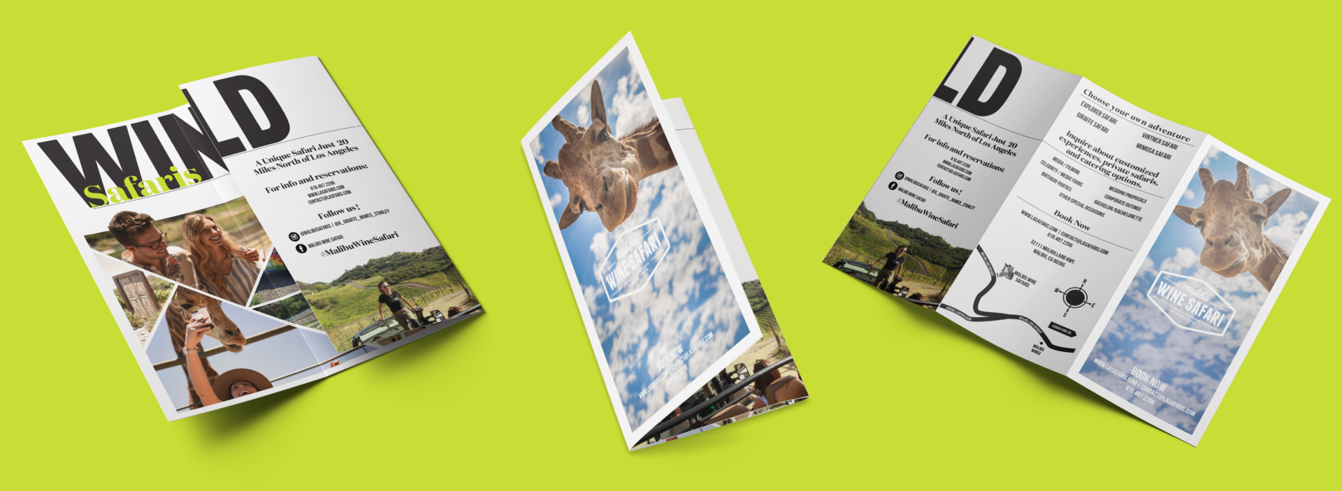
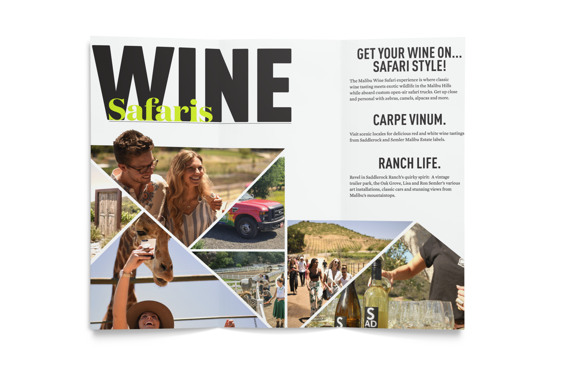
Malibu Wine Safari is a family owned operation within the Saddlerock Ranch, just 30 minutes from Los Angeles. Guests are invited to explore the 1,000 acre ranch and vineyard. Tour guides lead the adventure in custom-built, open-air safari vehicles. Along the way, the tour makes stops to take in the scenery, taste local wines, and get up close and personal with exotic animals, including zebras, camels, alpacas, bison and Stanley the giraffe. But for a tour chock-full of sensory experiences, their brochure left a lot to be desired. Heavily reliant on icons and weighed down by drab backdrops and an abundance of redundant copy, it was in desperate need of a redesign. Malibu Wine Safari approached Brand Knew to breathe life back into the brand’s most prominent piece of print collateral.
A Brochure That Reflects the Tour.
In approaching the brochure redesign, Brand Knew sought to tell a cohesive story through bold, beautiful imagery and clean white space, while keeping textual information to a minimum. The new brochure tells the customer everything he or she must know, such as the what, where, and how. But the why is told through bright, airy photography of the animals, the wine and the fun. The redesign does justice to the brand’s value proposition for customers and features Stanley the giraffe prominently on the front flap.